Custom widget layout
If there's a vision you have of some combination of text, color, or image, but can't quite get what you are looking for in the default toolset there's a widget for that in the Beckman Template. A word of caution, this is an advanced widget with many options, more options creates more complexity in the widget. We have made efforts to try to make this easier, but if you are unable to get things to work out, please reach out to webmaster@beckman.illinois.edu for assitance.
Beckman multi content widget
The Beckman multi content has multiple types of content to create a custom look. There are some types you need to be aware of when using this widget.
- Main grid configuration - This is the main working area and the parent layout for the content. Depending on what you want to create you'll need to adjust settings in this area and will be the first grid type object to get any other content types.
- Subgrid - The are grids layouts withing the main grid. These are help move items in offsets or in more detail around the main grid. To get more fine-grained control over the position of the element in a grid set the grid configuration larger.
- Image and video - These are standare types of object you can use from the library to add to your site.
- Content block - This is a standard content block with all tools available.
- Color block - This is a block of color using the fill colors available in the brand. You can use these as backgrounds, separators, or in what ever way you get the aesthetic you are looking to achieve.
Multiple types of these content items can be used. Recommendation is to start simple and make it more complex as you understand how the added content will fit your widget plans.
If you are not able to get the image you have selected to fill the entire area, check the height of the grid. It's likely the image does not fit the ratio you are trying to insert it into.
Add multi content widget to page
- Drag the Beckman multi content widget into the location you desire on the page.
- Click the edit button.
- Check other sections for details on how to configure this widget from the edit menu.
Content builder screen
This is the main screen of the multi content widget. From here you'll control which items are being edited or moved in the grid or subgrid. Content items are restrained to the grid or subgrid they belong and cannote be moved outside of them.
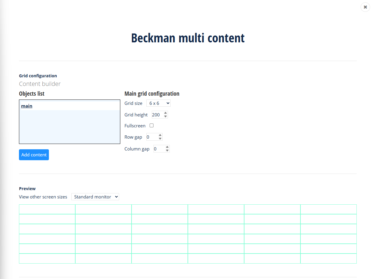
The main grid configuration screen has a few sections.
- Objects list section - this section will show which kind of content type we are working with at the moment. Also the buttons underneath the list objects are the actions that can be taken with the current selected object.
- Configuration section - this section to the right of the objects list section will be where most of the content is configured within the grid. For example for images this is where you will pick which image you want to use or with content blocks provide the necessary text. Also this is where you'll position objects with in the grids row and column layout.
- Preview section - a simulated preview of what the widget will look like and by changing the screen size you can preview what the widget will look like. This view is simulated and may not be fully accurate to what the widget will look like due to screen size limitation in the admin screen, but this is a decent estimation of what you will see. Always preview your page to see what it will truly look like before publishing the page.
To add content, especially to start, click the "Add content" button underneath the Objects list section with a grid or subgrid selected. If the option to "Add content" does not show, this is because you are not in a grid or subgrid, only these can contain other types of content.
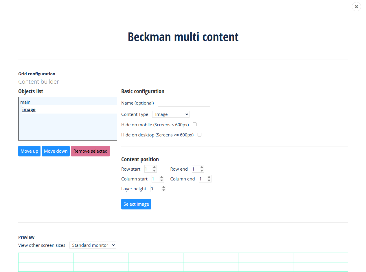
Once content has been added to a grid (including a subgrid to the main grid), you'll have options to move the row/col start and rol/col end of the content item. The content spans the rows or columns you select based on the start and end column.
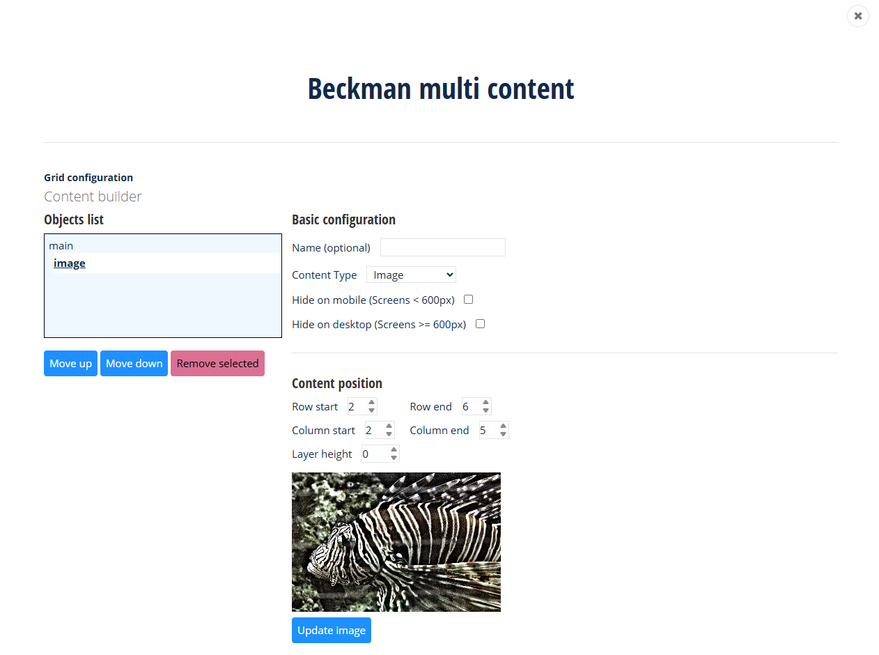
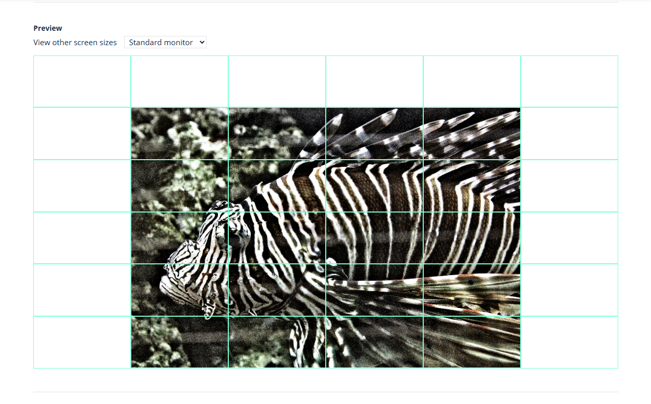
In the sample the image row to start at 2 and end at 6. The columns set to start at 2 and end at 5. This allows the image to fill up the content across these rows and columns in the widget. All content in the grid, including subgrids, works in the same manner they will start of positioned in the first row and column by default. Remember for images, you'll like likely need to adjust your height of the main grid to allow enough space to fix large row/col images.
Desktop and mobile views
In a content view you can determine if the content should be shown in desktop or mobile views. Use the checkboxes to set which content can be used in the respective views. Each content item can have a name, it's highly recommended to set this when multiple view are set. If you leave all items, then in mobile each content item is wrapped into it's own row.
Use the preview drop down to get an idea of what your widget layout will look like on multiple device sizes.
Layering content
Content items can be layered. Use the configuration item "Layer height" to set up laying. The higher the layer height value the higher a content sits in the stack of layered items (the closer it is to the user's view). All content items start are layer 0 the base layer.
For example to set a color block behind all other items. Leave the color block at layer 0, move all other contents items to layer height 1 and the color block content will be behind all other content. You can change these values as needed to create the desired layering effect. Make sure to check layering in mobile views as layering is disabled and if using color blocks you may have undesired results.
Beckman Web Template